📱 User interface
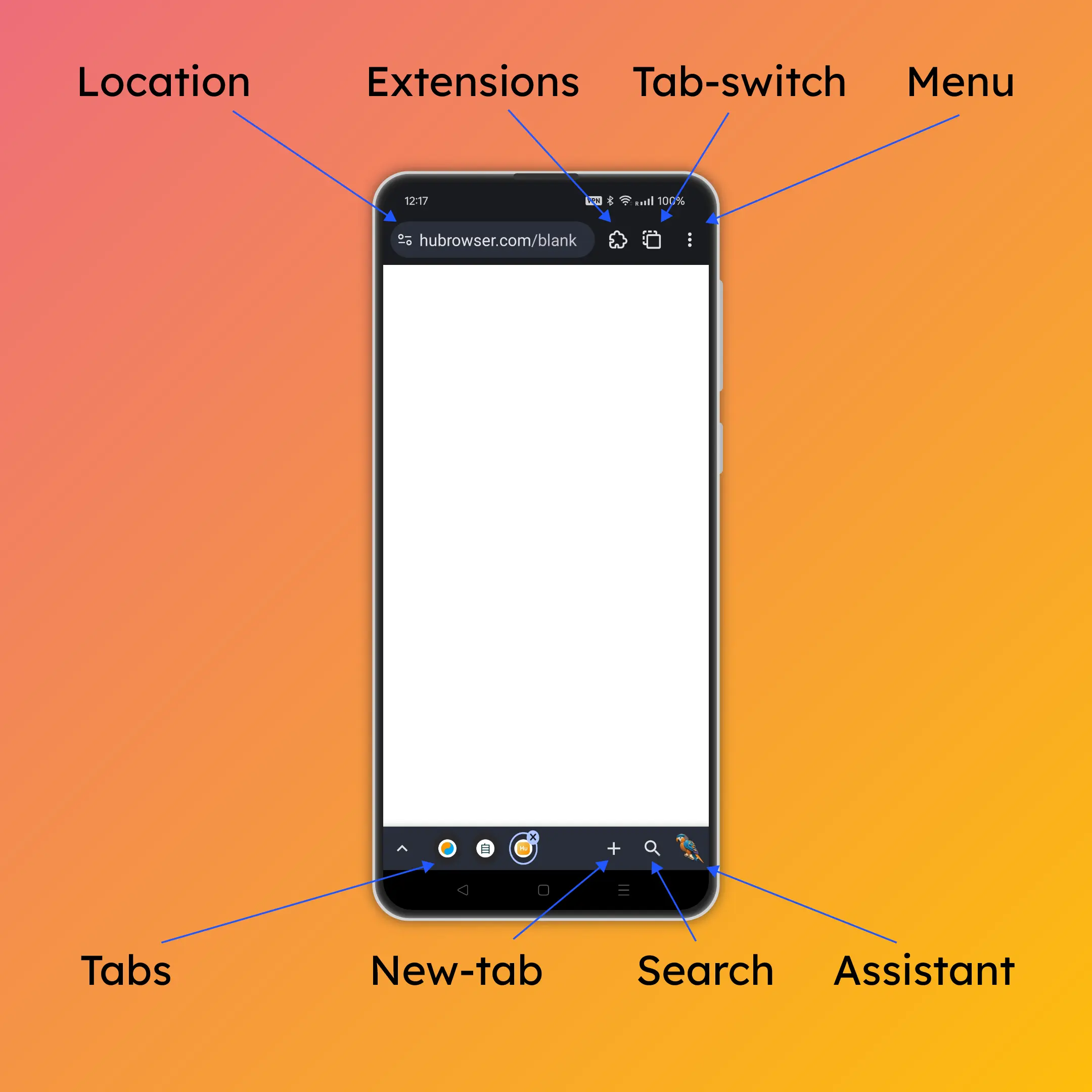
Top bar
Location bar
Enter search queries or URLs here.
Domain is displayed in white color, while the rest of the URL is in gray.
The small icon to the left of the URL is the page info button, which shows visit history, permission controls, etc.
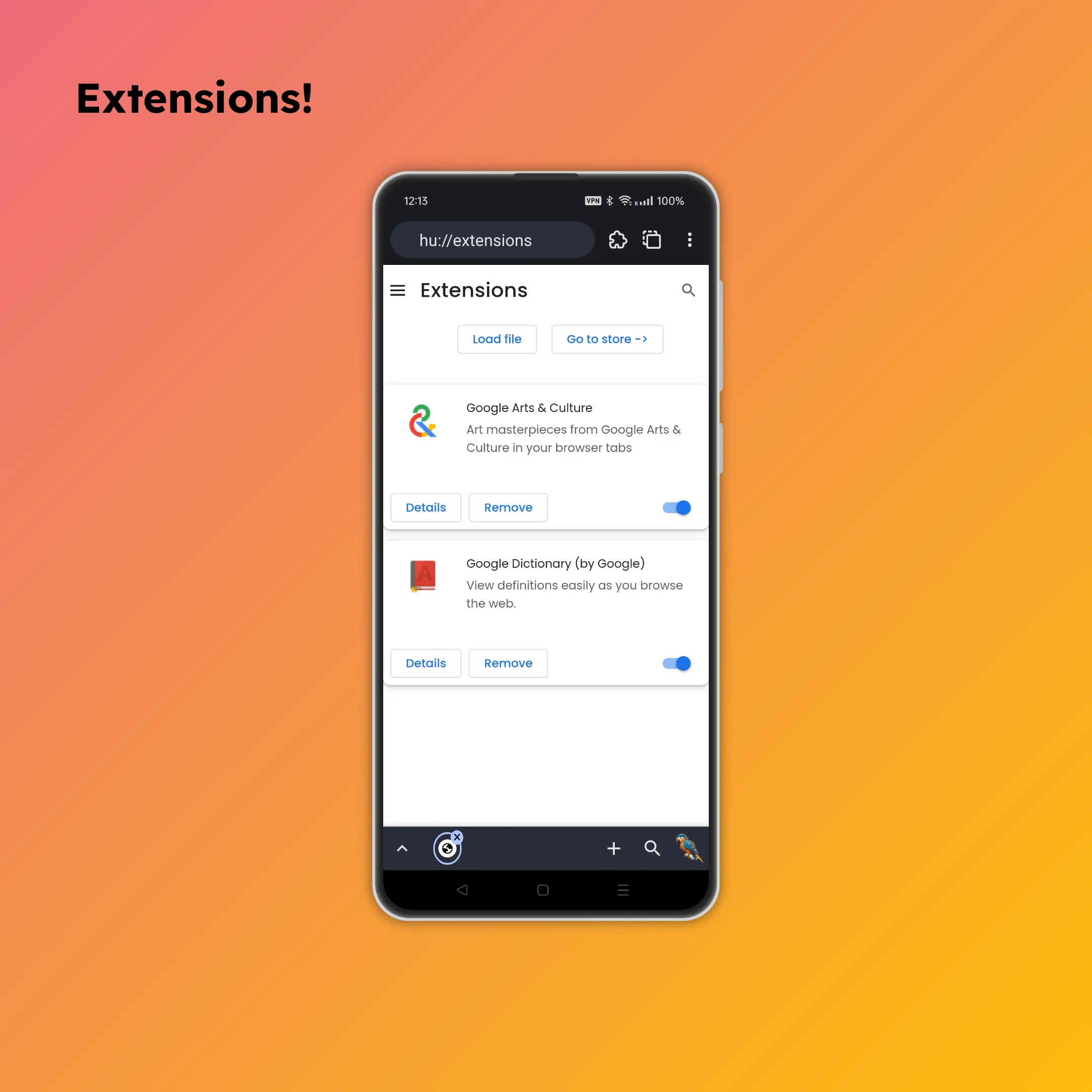
View installed extensions here.
You can also install local extensions.
Tab switch
Long press to go to the home screen, where recent and recommended tabs are shown.
Supports tab groups for better organization.
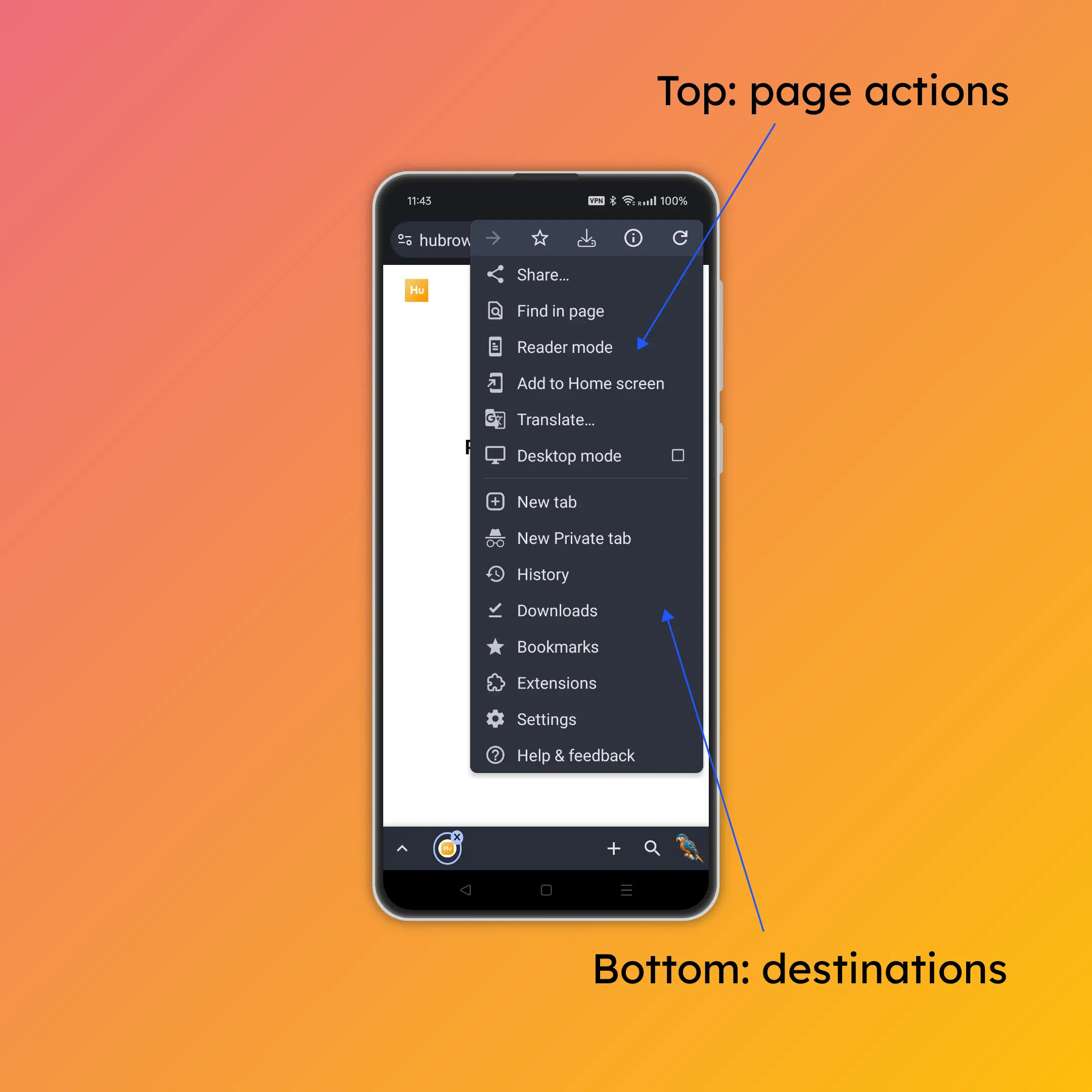
Access many useful features.
Top section: Page actions (e.g., refresh, bookmark).
Bottom section: Destinations (e.g., settings, help).
Bottom bar
Tab bar
Up arrow icon
See all tabs in the current group .
Tab icons
Switch between tabs with a single tap.
Tap the "x" icon to close the tab.
➕ New-Tab icon
Click to open the "new tab page," which shows recent and saved sites.
Long press New-Tab icon
Long press to search for copied text in a new tab.
If you copied a URL, it will directly open the URL.
🔍 Search icon
Our fingers mostly rest on the bottom of the screen. Instead of stretching to reach the location bar on top, simply press the search icon to quickly search or enter a URL.
Long press search icon
Long press to use "Dynamic Bookmarks" for easy access to thousands of operations!
Read more at Dynamic Bookmarks .
🦜 Assistant icon
Access the Parrot Assistant for help and suggestions.
Learn more at Parrot Assistant .
When pressing the back button:
If there is a system popup, it will close the popup.
If there is no popup, it will go back .
Webpage navigation
Forward: Swipe from the right edge of the screen towards the center.
Backward: Swipe from the left edge of the screen towards the center.
Many customizations 🎨
Explore the settings menu and you will discover the many ways you can customize HuBrowser to your liking
💡 Design rationale
Similar to chrome to reduce learning curve
Although HuBrowser is technically an operating system with a different architecture from Chrome, mimicking Chrome's UI helps users get started quickly.
Top bar
Why not put the location bar at the bottom?
Placing the location bar at the bottom would cause the bottom bar to render twice every time the keyboard pops up, negating render cache benefits.
A long location bar is mainly for display and would waste precious bottom screen space better used for user actions.
Top buttons are harder to press on small screens; the bottom action area is better suited for finger operation.
A long location bar is important for displaying URLs and search queries.
Helps prevent fraud by showing the full domain, avoiding misleading URLs where hubrowser.com.hugle.com might appear as hubrowser.com.
Why a static tab switch icon?
A static icon allows HuBrowser to cache the entire top bar for better performance.
Tab counts can add unnecessary mental pressure — HuBrowser's desktop-grade memory management allows as many tabs as desired, with no need to worry.
The number of tabs can be gauged roughly by looking at the tab bar or exactly by tapping the tab switch.
Bottom bar
The bottom bar is ideal for actions. 👍
Since the bottom bar needs to re-render when the keyboard pops up, it's better to place frequently changing elements here. 🔄
Symmetrical counterpart to the menu button in UI position and functionality:
The menu button offers layered, predefined options following industry conventions.
The Parrot Assistant provides a dynamic and personalized experience: control media playback, compare prices when shopping, invoke page-aware AI, etc.
Why does HuBrowser's back button behave differently from other apps?
In other apps, the back button sometimes goes back a page, sometimes closes the current page, and sometimes closes the entire app — this inconsistency can confuse users.
The back button is large and at the bottom, easy to accidentally press — if you're watching a video, filling out a form, making a payment, or playing a game and accidentally hit it, having to start over can be very frustrating 😂.
Going back a page can be done via the left-swipe gesture, which is just as convenient and won't cause accidental navigation.
Wrap up
Both the top and bottom bars are designed as one bar with three buttons, providing symmetry and consistency.
Space is efficiently utilized without making buttons feel cramped.
It's a perfect balance! 😊